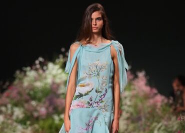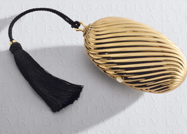

Mineral sage neutrals offer a sophisticated new foundation, while velvet plum, oxblood red and antique gold bring warmth and depth. Soft pistachio and powder blue provide a lighter counterpoint, creating a palette that feels both timeless and distinctly modern.
Sage Neutrals
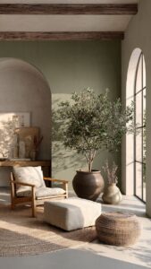
Beige and stone are shifting towards nature, with subtle green undertones giving familiar neutrals greater depth. Think dried sage, weathered olive and lichen rather than overtly botanical shades. These tones work particularly well across walls, upholstery and textured fabrics, creating a calm foundation that feels warmer and more distinctive than conventional grey, yet remains easy to layer.
Velvet Plum
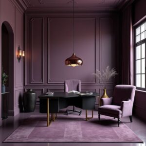
Moody purples are returning in softened, sophisticated forms. Shades of aubergine, damson and dusty plum bring richness without becoming overpowering, particularly when balanced with walnut, bronze or creamy neutrals. Used across velvet seating, lacquered furniture or a single enveloping room, the colour offers a quietly dramatic alternative to the deep blues and greens that have dominated recent seasons.
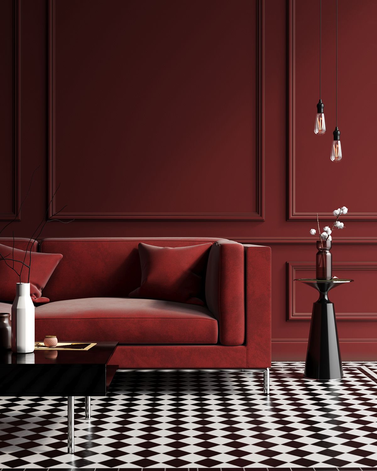
Cherry Red
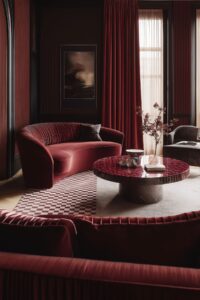
Deep red brings an assured sense of drama to autumn interiors. Moving from burgundy to oxblood and dark cherry, these shades feel both historic and contemporary. A lacquered cabinet or statement armchair can introduce the colour without overwhelming a room, while painting walls and woodwork in the same tone creates a more immersive effect with a distinctly luxurious character.
Antique Gold
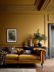
Gold is becoming earthier and more refined, with burnished ochre and saffron tones replacing brighter yellows. Its warmth makes it a natural companion to dark timber, aged leather and handmade ceramics. Introduce it through cushions, rugs and occasional furniture, or use it more confidently on walls to bring a lingering sense of late summer into the colder months.
Soft Pistachio
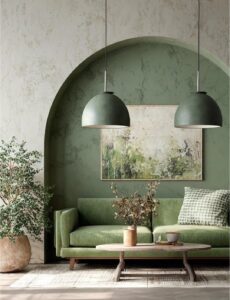
Pistachio offers a lighter interpretation of the enduring green trend. Fresh without feeling overly sweet, it brings a gentle lift to kitchens, bathrooms and relaxed living spaces. The shade pairs especially well with pale oak, brushed metal and warm white, while touches of chocolate brown or burgundy can ground its delicacy and give the palette a more autumnal direction.
Powder Blue
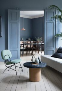
Light blue is losing its traditionally coastal associations and taking on a quieter, more architectural quality. Chalky, greyed versions create a serene backdrop while still introducing discernible colour. Used on cabinetry, ceilings or walls, powder blue complements travertine, dark wood and warm metals beautifully, offering a cool counterpoint to the richer, earthier shades appearing throughout autumn interiors.